A Vision for Inclusivity: How Optimal Contrast Ratios Define User-Centric Design
In the vibrant landscape of digital design, the concept of contrast, followed closely by the principle of optimal contrast ratios, stands as a cornerstone, going beyond mere visual appeal to champion inclusivity and accessibility across digital platforms. This vital component is instrumental in elevating user experience, catering to a wide audience spectrum in the UK, including those facing visual impairments such as colour blindness, visual processing challenges, and light sensitivity. These conditions significantly affect their interaction with digital interfaces. Despite the lack of comprehensive data due to under diagnosis and reluctance to seek professional advice, it's estimated that up to 8% of males and 0.5% of females with Northern European ancestry are living with some degree of colour vision deficiency.
Designing with contrast is not just an art; it's a commitment to creating a digital world accessible to everyone, bridging the gap between technology and empathy.
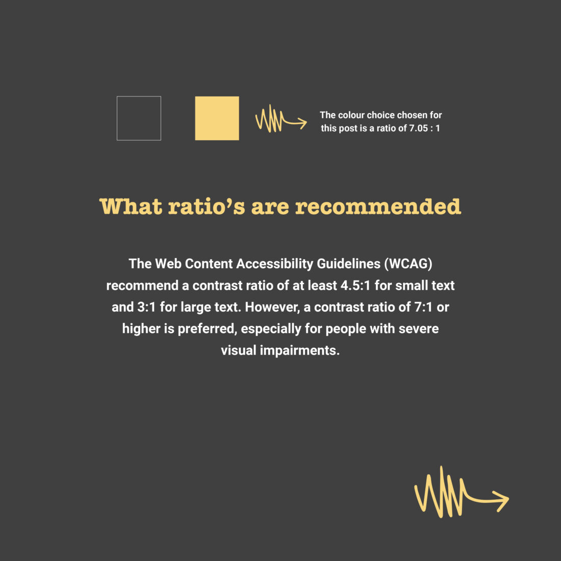
The emphasis on contrast and the strategic application of contrast ratios in digital design transcends conventional aesthetics, serving as a beacon of inclusivity. It ensures that websites and digital interfaces are meticulously designed, considering the varying visual requirements of users. This inclusive approach not only accommodates individuals with specific visual impairments but also elevates the usability and engagement level of digital content for a broader audience. By prioritising optimal contrast ratios, designers commit to a more empathetic and technology-driven strategy, highlighting the significance of user-centric design principles in creating accessible digital spaces.
This philosophy of integrating high contrast ratios in design practices underscores the intersection of technology, creativity, and empathy. It champions the creation of digital environments where accessibility is not an afterthought but a fundamental design criterion. This approach has far-reaching implications for enhancing brand visibility, improving user satisfaction, and driving return on investment through thoughtful, inclusive design strategies. Thus, the meticulous attention to contrast and contrast ratios is not merely a technical requirement but a testament to the evolving ethos of digital design, where every user's experience is valued and optimised.

